All
Jun 25, 2021
Try our Keystroke Figma template
Introducing KEYSTROKE ⌨! My first Figma community template to create keycap quickly (with auto-layout support!). Quickly create keyboard shortcuts on Figma now!

How to use?
- Open figma community file
- Click "Duplicate"
- Copy the component to your own file
- Start typing in the text layer in the middle

Where can I download it?
View file here or search "Keystroke" on Figma Community or click
Remember to use scale ("K" key" to resize since borders are outlined already! Let me know what you think and how would you apply it to your design using #MadeByJUXT
View MoreJun 17, 2021
Lets talk about Safari & Firefox design revamp
Brand new Safari and Firefox were both announced this month. Both versions received major design iterations. Which do you prefer?

Announced in WWDC, Apple's new Safari is more ground-breaking in terms of UI and interaction. Merged address & search bar aims to reduce occupied space, while color-adaptive background will help the browser blend into webpages. Safari also underwent some big changes on iOS too. Address bar has moved to the bottom for better reachability.


As for Mozilla's Firefox, changes stay at interface level. Tabs are elevated to the top and simplified toolbar. Right-click menu is now native that supports light & dark mode.
95% of what you see when you open a browser window belongs to the website that you’re there to view rather than Firefox itself.
Behind the design: A fresh new Firefox
What do you think and what change do you want for your browsers? Safari is coming this fall and Firefox update has launched on June 1.
Stay tuned for further walkthrough and review!
View MoreMay 27, 2021
Using Chrome DevTools for Color Accessibility
One simple step to enhance your website's accessibility is checking your colors. 8% of all men suffer from color vision deficiency (0.5% in women), so 1 in 12 males that visited your website may experience difficulties if your design is not accessible.
Until few years ago, colors on a website have to check one by one using contrast checker or by completing a site audit. Recently, I discovered Chrome Devtool shipped new feature that is very handy in fixing color accessibility issues.
What is the standard of color accessibility?

The Web Content Accessibility Guidelines (WCAG) dictates the recommendations to make the web more accessible. Two sets of ratio are set for different font size
- Level AA (Minimum contrast): Contrast ratio should be at least 4.5:1 for normal text and 3:1 for large text
- Level AAA (Enhanced contrast): Contrast ration should be at least 7:1 for normal text and 4.5:! for large text
Then what is the definition of normal and large text? Although WCAG referenced to 14pt and 18pt for normal and large text, in web standard, pixel (px) is the common unit, which is 24px and 18.67 px respectively.
How to use Chrome DevTools for checking color accessibility?
Best reason why you should try using Chrome DevTools is because it is free and probably installed in your computer already. Just browse any website and right click on elements you want to select, and tap on "Inspect".

Chrome DevTools will pop up a window. Focus on the right side, which state style properties. It's ok if you don't fully understand CSS but we are looking for properties related to color, like color for text color, background-color for background color.

Click on the square block with color, there will be a tooltip that allows you to pick new colors. We can also see a line is called "Contrast Ratio", clicking on the row will further expand in displaying all accessibility information.

We can see that the current color only passed AA standard, but failed on AAA standard. How can we fix that? While you can click on the suggested color block on the right to fix the issue, a new feature is indicator lines on the color spectrum, showing colors within the spectrum that is passing standard.
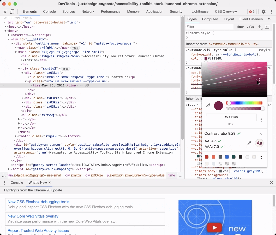
The top line refers to the AA standard, while the bottom line refers to AAA. Now you can easily pick any new colors that are accessible.
What if there are no contrast information available?
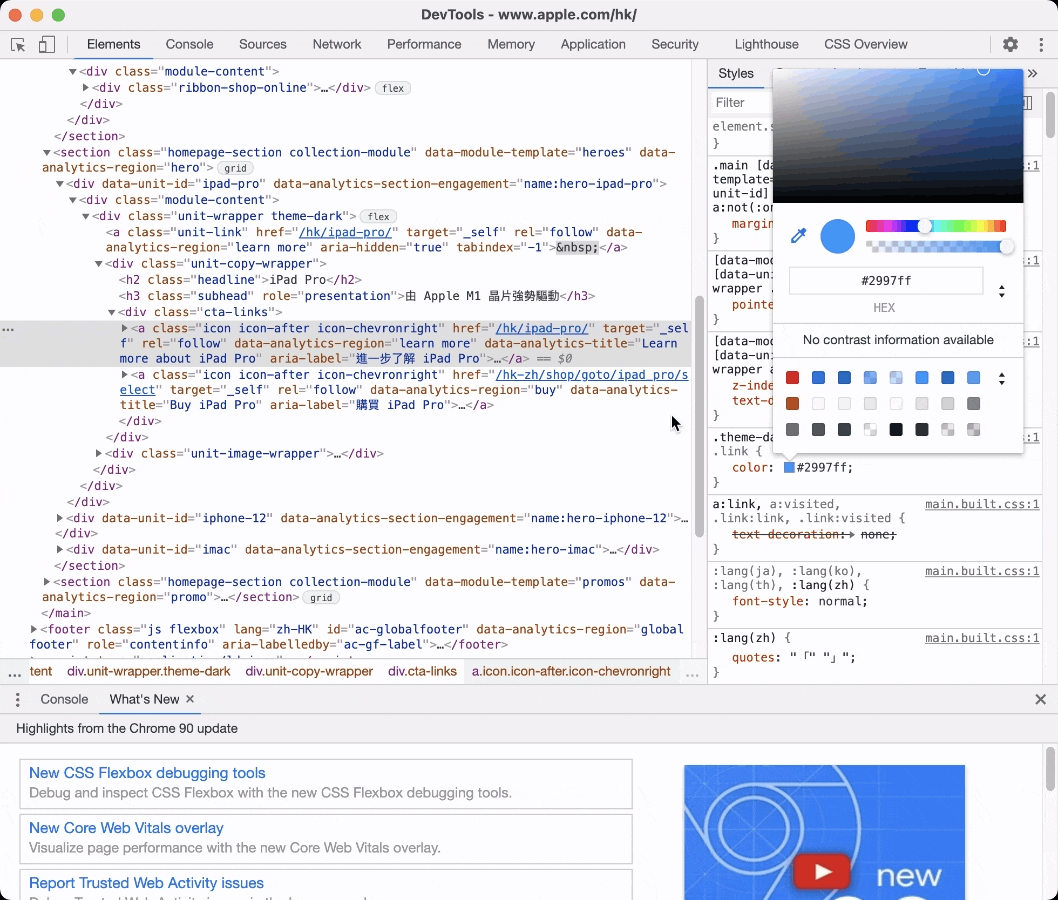
By default, Chrome will pick the background color automatically, but if it is not available, we can add it manually. Click on the line below color and start typing background-color: black. Then click on the black color block and use color picker to pick the real background color.
What other tools can I use to check color contrast?
Other than Chrome DevTools, there are a lot of other accessibility tools that can help you to create accessible design. A classic would be WebAim's contrast checker, Coolors.co also offer a easy-to-use contrast checker. If you want to check your colors within your design tools, Stark offers plugins for Figma, Sketch and Adobe XD as well!
Try Chrome DevTools today and let me know if there are any accessibility tips that I'm missing!
View MoreMay 25, 2021
Accessibility Toolkit Stark Launched Chrome Extension
Stark has been a very helpful tool for creating accessible designs. The all-in-one accessibility toolkit has launched Chrome version after focusing on design platforms like Figma, Sketch and Adobe XD.

Two main features launched today include color contrast checker and colorblind simulation. Smart color suggestion, recommendation of alternative colors if the contrast does not pass WCAG 2.0 level, however, has yet to found on Chrome. it is a feature that I use all the time.
View MoreAug 22, 2020
Design Documentaries

Catching up with some design documentaries in the last few months during quarantine, here's my recommended list!
Abstract: The Art of Design (Free on Youtube, Available on Netflix)
The two-season documentary series highlight artists across various fields of design. Each episode is an in-depth look of how design is implemented around our everyday life.
@abstractdesign
Discover the history and cultural impact of the famous typeface Helvetica, also known as Neue Haas Grotesk.
Documentary on the manufactured designed objects and the process of its creation. Also directed by the same director Gary Hustwit.
After interviewing Dieter Rams in Objectified, director Gary Hustwit started a new project to continue the conversation with him, further exploring this key design figure in influencing modern industrial design.
Got any favourite design documentaries to share? Share with me on @juxtdesignco
View MoreAug 14, 2020
How do you save your inspirations?
How do you save your inspirations? Recently I discovered Raindrop.io, a bookmark manager developed with designers in mind.
There are multi-purpose views that you can set for each collection, Like List, Headlines Grid, Moodboard.
Of course, you can tag bookmarks and put them in different collections (folder). Thumbnail can be uploaded manually if crawling does not work. There's also auto-suggestion to tag base on page metadata.
It's impressive that the app has extensive browsers support (Chrome, Firefox, Safari, Opera, Edge)and mobile app available. However, features on app are quite limited at current stage.
View more on https://raindrop.io/
View MoreAug 13, 2020
Good Product Is Not Earning Every Dollar

Good Product is not earning every dollar. Netflix recently announced they will start cancelling inactive subscriptions, Slack also carry out "Fair Billing Policy" to charge only active users in paid plans.

These companies can earn more money but they choose not to. This is because gaining users' trust & loyalty is more important than the monetary return.

Usage-based billing is a pricing model that can be both reasonable & flexible for users. Making the process transparent and credible will gain users' trust and loyalty.
View MoreAug 11, 2020
What is sitemap and how does it enhance user experience?
What is sitemap and how does it enhance user experience?
Simply put, sitemap is a list of pages of a website. It displays how your website is structured visually.
How can it can help?
Laying out sitemap can help you to improve your website navigation, you can also spot out the ignored pages & content that are not internally linked. Last but not least, by enhancing user experience, you are saving time & cost to reply enquiries when visitors can browse the website directly.
View MoreAug 11, 2020
Google to offer UX Career certificates
Good news 📰! Google is offering UX Career Certificate on Coursera later this year, which will be recognized internally for hiring (equivalent to a 4-year degree in the related field). More courses for Data Analyst and Project Manager are also coming soon!
View MoreAug 09, 2020
3 Quick Wins To Make Your Website Accessible

The first tip from @juxtdesign is Accessibility ✌️ ! Accessibility matters because making your site accessible meaning even more people (more than 1 billion disabled people in the world 🧑🦯🧏🧑🦽) can easily access your site. It stands for diversity and inclusion for your company and there are guidelines for you to follow.
Step 1: How to evaluate my site's accessibility?

Use Web.dev or WAVE to spot out the accessibility problems on your website. Little effort to your site can make your accessibility score up to 90+.


You can also use Stark on Figma & Sketch when you are designing app interfaces.
Step 2: Quick wins to make your site accessible

Add alt text to images on your website to make your images speak for themselves. You can also double-check your color contrast is accessible to visually impaired users. Keep in mind that your site should be properly organized in a hierarchy.
")


Step 3: There is no step 3! Sit and wait for more traffics to come over time.
Have I mentioned accessible websites are easier found by search engines as well?
View MoreJul 05, 2020
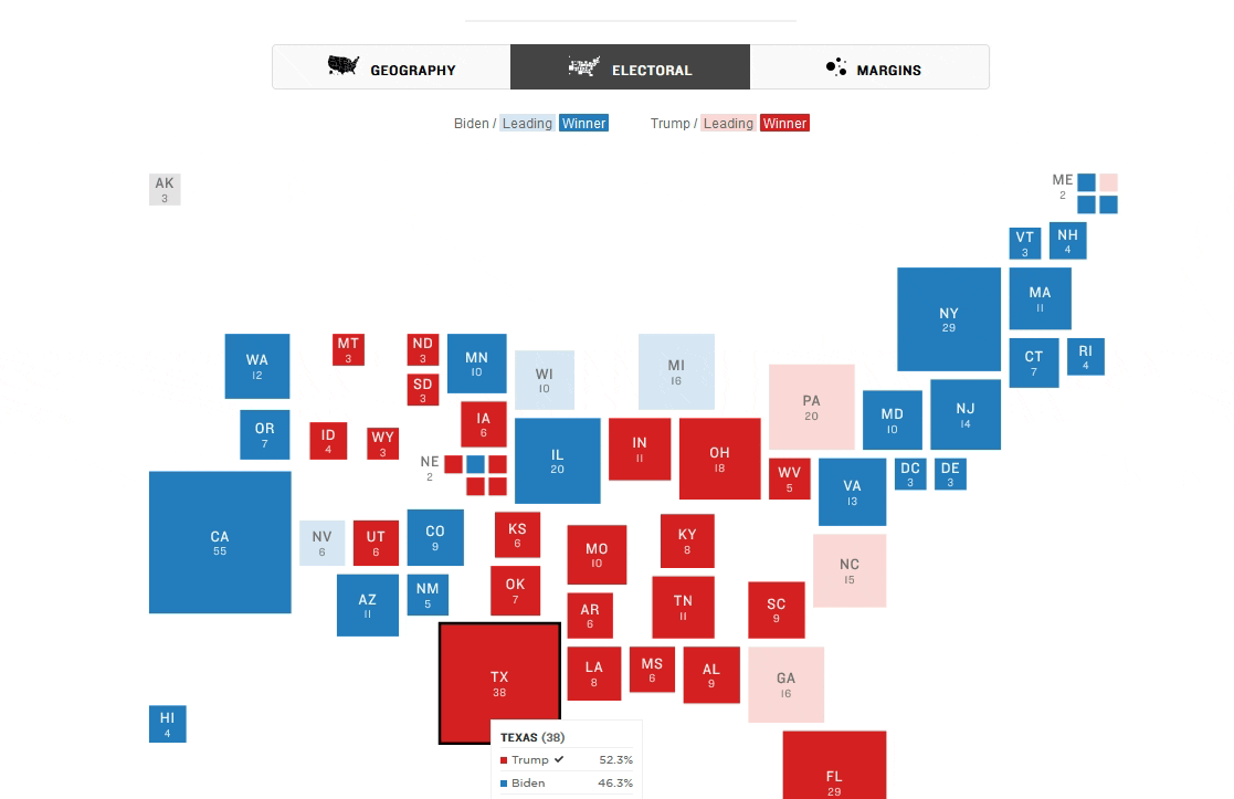
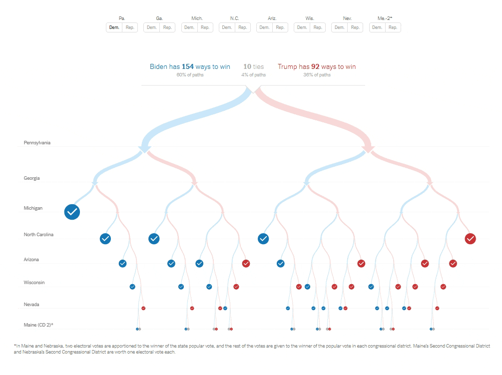
Infographics of US Elections
Let's take a moment to appreciate the design of infographics and interactive websites created by major news outlet for the 2020 US Elections.

View MoreAug 26, 2018
Why designers need a personal website?
One of my year resolution for 2018 is to learn front-end coding. I feel that being a designer, learning how to code is the way how I could step up the game in web design, by understanding how every bit and piece fall into places.

I had two personal websites, one is my Tumblr and another is my portfolio site, separately hosted and running Cargo Collective. But I was thinking, "Wouldn't it be great if both of my portfolio and blog are together?"
Why do you need a personal website?
It's 2018. Online presence is becoming the norm, even in the professional field. Your previous work, your side projects, even your work in progress matter.
A personal site also means more control over your message and story, whether you're looking for new clients, landing a dream job or establishing a personal brand. For sure it takes more time and effort, but I think it is quite a good practice to sharpen your skill and catching up. Needless to say, making a personal site is much easier than a decade ago.
While platforms like Medium, Facebook Pages are building homogeneous style for coherent browsing / reading experience. Your website should pursue personality instead. I'm not saying you shouldn't post to Medium publications or run a Facebook Page, but just not as the destination but a way to reach your very own website where you deliver your message.
What're my options?
Speaking of the BIG question, which platform should you choose? Wordpress is great for beginners since all settings are visible without dealing with code. But it was developed as a blogging platform, so it requires specific template in order to create a decent looking personal page.
Website builder like Webflow and Squarespace is also an elegant option, but they adopt subscription model so the cost would be definitely higher.
After taking the Design+Code's React course instructed by Meng To, I was introduced to Gatsby.JS. After trying it out for few weeks, I genuinely rooting it as the up-and-coming personal website & blog option. Because:
- A custom personal website allows maximum creativity, a great advantage for designers.
- It's blaze-fast. Because all files are generated already. It also adopts modern web technology like React, Webpack and GraphQL. I compared the Lighthouse audit ran on beta site and current site. Performance has insanely improved.
- Gatsby is a static site generator, but dynamic data source is widely supported. Wordpress, Contentful or even Airtable can be used as a database.
- Deploying is as easy as drag-and-drop. Netlify provides free hosting for static site, and Gatsby is free, meaning the project could be free as long as you have your own domain.
- Personal reason but a good one. I admit the process of making your own site is empowering. It's nice to not rely on anybody and build a website designed and developed all by yourself. I've been taking some screenshots logging daily progress, will share it later.
Last word
As Gatsby is quite new since it was first released a year ago. I wouldn't say current resources available is sufficient, but it is a strong and growing community. Most users are frontend web developer right now, but I'm optimistic to see more designers onboard.
I admit there is indeed a learning curve to React, Gatsby and also GraphQL since I know fundamental HTML and CSS only. There were long nights that I was figuring out causes of errors, which turned out to be some stupid mistakes.
I'm writing this also for my own future reference:
A personal website should not only showcase your work, but also speak who you are and how you work.
That's why I'm eager to share my work in progress, hoping to launch the site as soon as possible.
Reading List:
Things I (honestly) don’t want to see in your portfolio
View More


